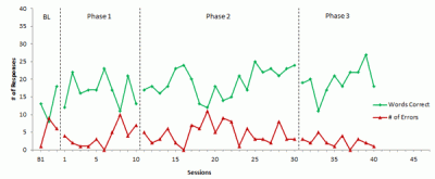
Data collection for my dissertation is nearly done – I’ve been at it, nearly full-time, since mid-January. Although the participants are great, I’m simply exhausted. Fortunately, essentially all of my data collection will be done this week. As a result, I will now be entering the final stage of the program – writing up the “Results” and “Discussion” sections of my dissertation (the lit review and methods sections were completed and approved last Fall). Although this final stage should be the most “fun,” I’m engaged in yet another battle with Microsoft Excel. It always amazes me as to how clueless programmers are to the needs of real users. I’ve now spent days/weeks fighting with Excel in order to create graphs for my multiple-baseline across-participants single-case research and finally conquered the last hurdle, thanks to a response to a question I asked on an Excel Forum. Here’s a sample:

I’ve also created an “instruction guide” (for me) so I won’t forget how to create the graph. Here’s the link to: Jeff’s Single Case Design Graph Instructions. Please note that I did not proofread it – it was created only for my use but I’m posting it here, just in case someone else is interested in “how I done did it.” Enjoy!
